Why Vibe Coded Interfaces All Look the Same (And What Designers Can Do About It)
Every vibe coded interface looks the same. That is not an AI problem. It is a brief problem. Here is what designers can do about it.
Every vibe coded interface looks the same. That is not an AI problem. It is a brief problem. Here is what designers can do about it.
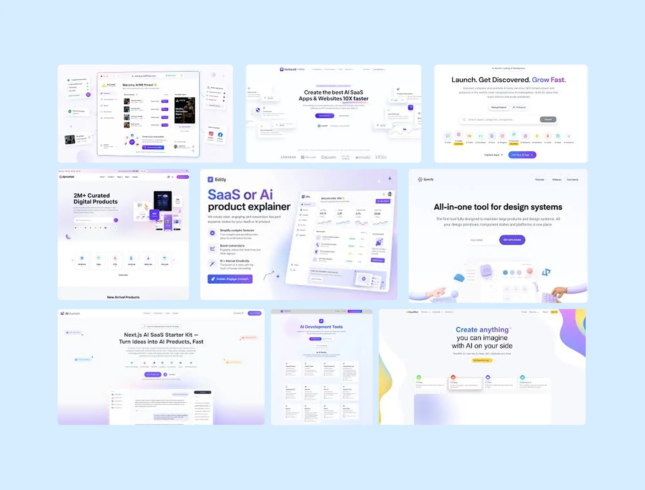
Same Inter font. Same Lucide icons. Same blue to purple gradient. Same rounded corners on everything. Same ”clean, modern” aesthetic that whispers ”an AI made this” the second you land on the page. If you have spent any time looking at vibe coded interfaces, you have seen this pattern. And vibe coding design quality is the conversation the industry is just starting to have.
The irony is almost too perfect. A technology that promises to democratize creation is producing a monoculture. Everything looks competent. Nothing looks distinctive. The output passes a functional review but fails the ”would I actually remember this website tomorrow” test. I have thoughts about why this happens and what to do about it.
Why Vibe Coding Design Quality Suffers
The default explanation is ”AI is bad at design.” That is lazy and mostly wrong. AI models are trained on massive amounts of existing code and interfaces. They know what a dashboard looks like. They know common patterns, popular component libraries, trending color palettes. The problem is not capability. The problem is direction.
When someone prompts ”build me a dashboard for a fintech app,” the AI generates the statistical average of every fintech dashboard it has seen. The result is not bad. It is just profoundly generic. It looks like the platonic ideal of a dashboard that nobody designed intentionally.
Designers do not start with ”build me a dashboard.” We start with questions. What personality should this interface have? Who is the user and what emotional state are they in when they open this? What visual references anchor the brand? What makes this product different from every other product in its category? Those questions produce constraints. And constraints are what AI needs to produce distinctive output. Without them, you get the same floating cards, the same 8px border radius, the same generic illustrations that look generated because, well, they are.
The Brief Problem, Not the AI Problem
The vibe coding design quality gap is a briefing gap. The people getting generic results are giving generic prompts. The people getting interesting results are giving detailed, opinionated, specific prompts. This is exactly what happens with human designers too. Give a designer a vague brief and you get safe, predictable work. Give them a brief with clear constraints, strong references, and a specific point of view, and the work gets sharper.
The difference with AI is speed. A human designer will push back on a vague brief. ”What do you mean by modern? Show me what you like.” AI does not push back. It just delivers the average. And because the average arrives in 30 seconds, people accept it and move on. The speed that makes vibe coding powerful is the same speed that makes mediocre results feel good enough.
I wrote about this in vibe coding for designers, specifically the layered approach. You would not open Figma and try to nail the final design in one frame. You build in layers. The same discipline applies to prompting. Start with structure. Add typography. Layer in color. Refine spacing. Specify interactions. Each prompt adds precision. Each round of precision moves the output further from generic.
What Designers Bring That AI Cannot Generate
Taste. That is the word people dance around but it is the right one. Taste is knowing that a 2px border communicates something different than a 4px one. That warm off white feels more inviting than pure white on a wellness brand. That generous whitespace signals confidence while cramped layouts signal uncertainty. AI can execute on taste, but it cannot originate it.
As Nielsen Norman Group recently noted, when you leave design decisions up to an AI system, the results tend toward generic looking outputs with random layout choices that lack clear purpose. The AI is accountable for execution. But design judgment still belongs to the person behind the prompt.
This is why vibe coding design quality is ultimately a design literacy question. The output ceiling is set by the prompter’s ability to describe what good looks like. A developer who knows React but has never studied typography will produce different output than a designer who thinks in visual systems. Same tool. Same AI. Completely different results.
Practical Ways to Push Past Generic
Define your visual identity before you prompt. Decide on your palette, type scale, spacing system, and personality before you open any vibe coding tool. When the AI receives constraints, it has something to work with beyond its own defaults. This connects directly to knowing when your brand needs a full visual identity system.
Reference specific design systems rather than vague adjectives. ”Use the shadcn/ui components with a zinc color palette, 14px base type, and 24px section spacing” produces wildly better results than ”make it clean and modern.” Being specific is not being rigid. It is giving the AI the creative constraints it needs to produce something with character.
Iterate like a designer, not like a prompter. Most people fire one prompt and accept whatever comes back. Designers iterate. First pass: structure. Second pass: typography and hierarchy. Third pass: color and personality. Fourth pass: micro interactions and polish. Each pass refines. Each refinement moves the result further from the default aesthetic.
The Real Opportunity
Here is the thing that excites me about this moment. The sameness problem is an opportunity for designers. If every vibe coded interface looks the same, then every interface that does not look the same stands out dramatically. The bar for distinctive digital design has not been raised. It has been lowered. The average just got more average. Which means the gap between average and exceptional is wider than ever.
Designers who can articulate a strong visual point of view and translate it into precise prompts have a genuine competitive advantage. Not because AI cannot design, but because most people using AI are not designing. They are generating. There is a difference, and that difference is the same one I draw between UI thinking and UX thinking. One is about vision. The other is about structure. You need both, and you need them to be intentional.
The tools are getting better. The models are getting smarter. But taste, intention, and the courage to make specific choices instead of safe ones? That is still a human skill. And right now, it matters more than it has in years.
Read next